Plot two columns against eachother
I don't think this should be difficult, but I'm pulling my hair out trying to do it.
I am trying to make a chart of age vs BMI. I have a column with age and a column with BMI. The table looks something like this:
-------------
| Age | BMI |
-------------
| 5 | 13 |
| 6 | 22 |
| 5 | 21 |
| 7 | 15 |
There are more columns, but that isn't important right now. I want the BMI to be on the Y axis (easy) and the age to be on the X axis (surprisingly difficult). If I use a line graph I can select the age to be x value using Chart Tools > Design > Select Data, but that does not stack the values. In other words, all of the age 5 data points would not be aligned vertically. The x axis for my example above would look like this:
-----------
| | | |
5 6 5 7
If I sort my table by age I would get something like this:
-----------
| | | |
5 5 6 7
If I try to make a scatter plot I get the same results.
I have tried the suggestions in the thread below, but they all give me the same thing. Please help.
Map one column to x axis second to y axis in excel chart
11 Answer
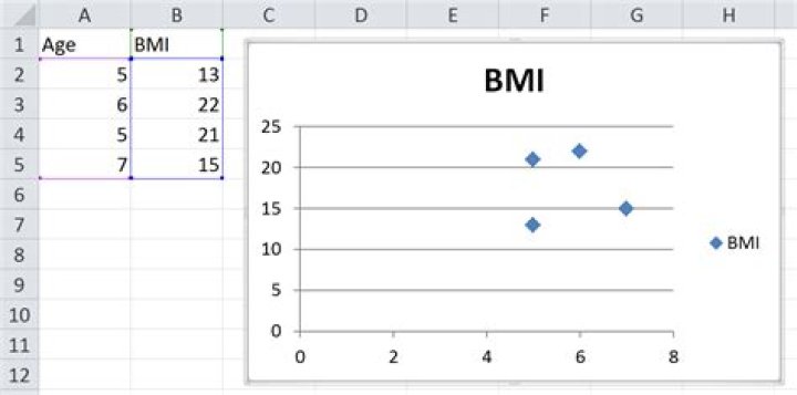
Here are the steps I followed to get the image below.
- Recreate your example data in the range
A1:B5 - Select the range
A1:B5 - On the Insert ribbon, I clicked Scatter (in the Charts group) and chose the first option
The result is shown below. I have taken no other steps to alter the chart in any way and it seems to be exactly what you want. You problem might have arisen if you started with a line chart and then tried to modify it from there. Try creating a brand new chart and see what it spits out.