Excel is plotting my date x-axis completely wrong, and I cannot work out why
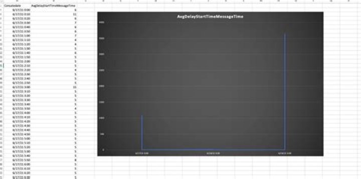
I have a very simple Excel data set which plots 15-minute date/time segments against values.
When I try to plot it as a line graph in Excel (mac), Excel inexplicably renders the results wrongly. It seems to plot only one value for each day, and I cannot determine how it is picking which value to show.
The only way I can get it plotted correctly is by changing the data into a Pivot table and then it plots fine, even though the data is exactly the same.
You can see some sample data here with the Excel rendering:
1 Answer
Try right-clicking on the data labels (i,e,e the dates on the chart), select "Format Axis". Under Axis Options -> Axis style, choose "Text Axis"